

Subtly or directly, color affects everybody’s thought process. So, if one color makes you happy than another color probably reminds you of a childhood memory. No wonder then that even business organizations are aware of color psychology and make some smart choices when it comes to using color to combat competition.
It is all about brand promotion
If you were to take a look at some of the most popular Brands and businesses all over the world, they get associated with many things such as:
- The shape of the letters of their business name.
- The look of their logos.
- Their slogans.
- The corporate colors – after all, isn’t Ferrari Red an icon by itself?
It therefore goes to prove that you must pay attention to choosing the right colors or the combination of colors to build your brand.
Color power
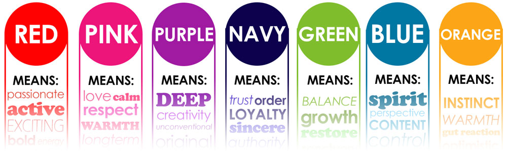
There are quite a few popular associations with certain colors. It would be good for you to remember that:
- Red is associated with power.
- Blue is related with trustworthiness.
- Yellow is another shade that is connected with positive vibrations.
- White is typically associated with purity and cleanliness.
- Black is linked to elegance and sophistication.
Your choices of color also depend on the industry that you operate in. For instance, white is a great color to use if you are in the Health Care segment. Orange is often associated with the food industry. Green, for obvious reasons, is a color that is associated with the agriculture sector and even the finance business.
Your packaging decisions
Your choice of colors is not limited to your brand or logo alone. You should also make packaging decisions so that your products standout in crowded retail spaces. Here, it would be a good idea for you to check out what are the colors that your competition is using and then go with something that is completely different.
In a department store shelf, your product will be placed along with your competitors’ products. And therefore, if you choose to go with a combination of colors that is completely unique and different, you will obviously catch the shoppers’ eye.
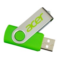
Promotional items, lanyards, conference gifts etc
As we are a lanyard company it seems only right we should mention about using the correct colors to design and brand your lanyards and promo items. Your staff probably wear a uniform, and using a bright and vibrant color for a lanyard or a wearable item might seem like a brilliant solution. But be weary of the affect that this has on your brand. For example above we mentioned above, red conveys power. This is fine if you are a gym or a boxing club but it’s no good for an accounting firm or a SAAS startup. Navy is for trust but sometimes doesn’t stand out well, Try mixing a bright color with a dark one. Or using bright colors on a white lanyard can also be very effective.
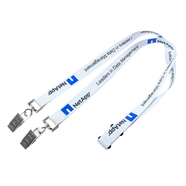 The NetApp Lanyard uses white as a base which stands out very well on most colors, but employs vibrant blue and rich black to display it’s message. Don’t be afraid to mix up and experiment.
In website design and user interfaces
Flat design philosophy and the use of simple combinations of colors and fonts is the ‘in’ thing when it comes to designing web sites. This simply means that you choose a combination of colors that is pretty basic but at the same time very exclusive.
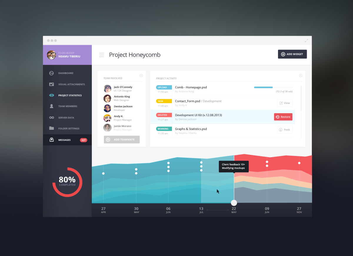 An example of a flat, very well designed web interface for Project Honeycomb. Somehow, the dark gray works very well with the other colors utilized in the charts and tabs associated with the dats.
Ideally, the colors of your website should be a continuation of the colors of your company or logo. This will give the online visitor an easy way to relate to your brand. An interesting process here is to design your website as if you are designing a poster – this will allow you to treat color as a powerful tool.
To summarize
It would be useful to sum up by saying that your colors should reflect the personality of your brand. It would also be useful for you to conduct a study and analyze the customers’ perception of your brand personality as well.
You can then sustain this perception or change it completely by choosing your brand colors accordingly. If you can do this at the conception stage of your brand then great! If not then maybe consider a brand transition.
Bonus tip, don’t go to heavy on the rebrand
From my experience its never a good idea to dump a full rebrand on your clients or audience, you’ll receive mixed opinions and some customers may even abandon you as they will perceive your brand in a different light. A lot of larger companies choose to slowly move towards new colors, introducing them into various print and web marketing items and then eventually making the major shift to new logo, new colors etc.